POWDER ROOM REMODEL - VIRGINIA BEACH

Personality? This revitalized powder room definitely has it! Check out these before and afters!

BEFORE

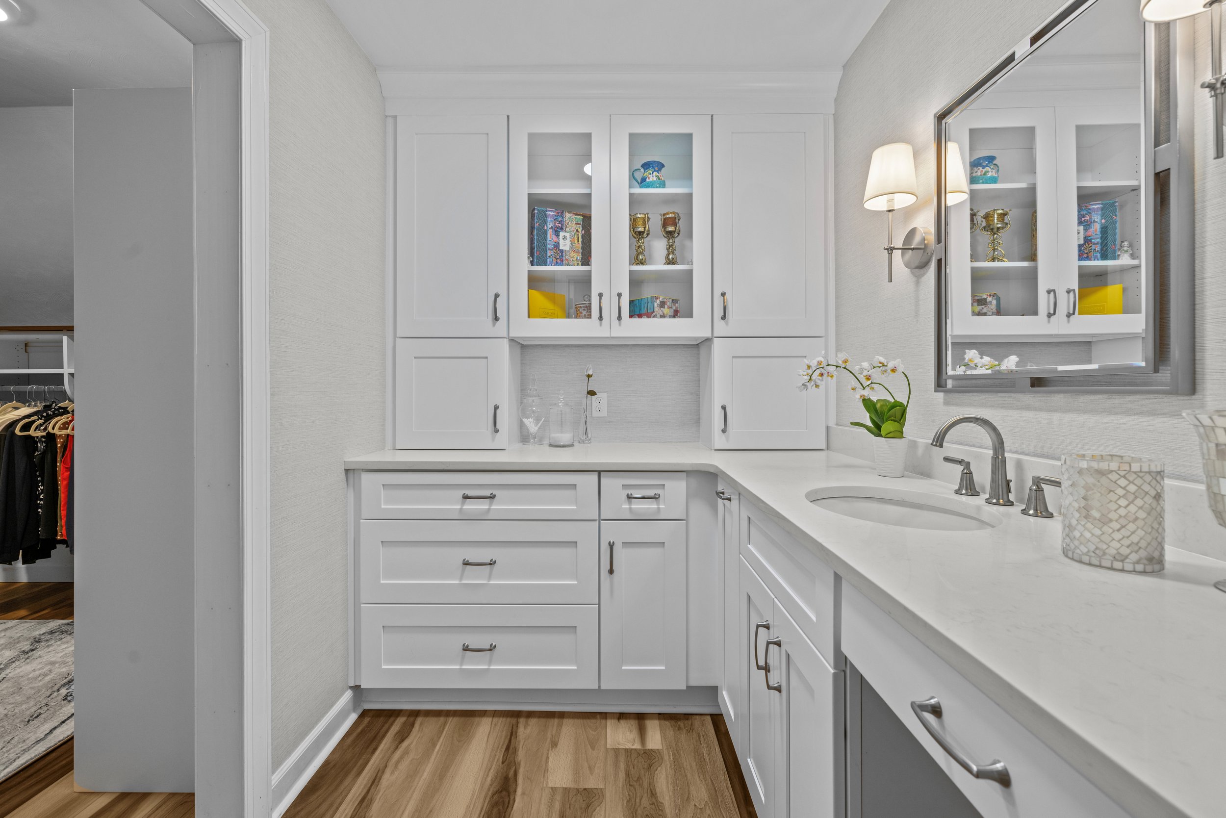
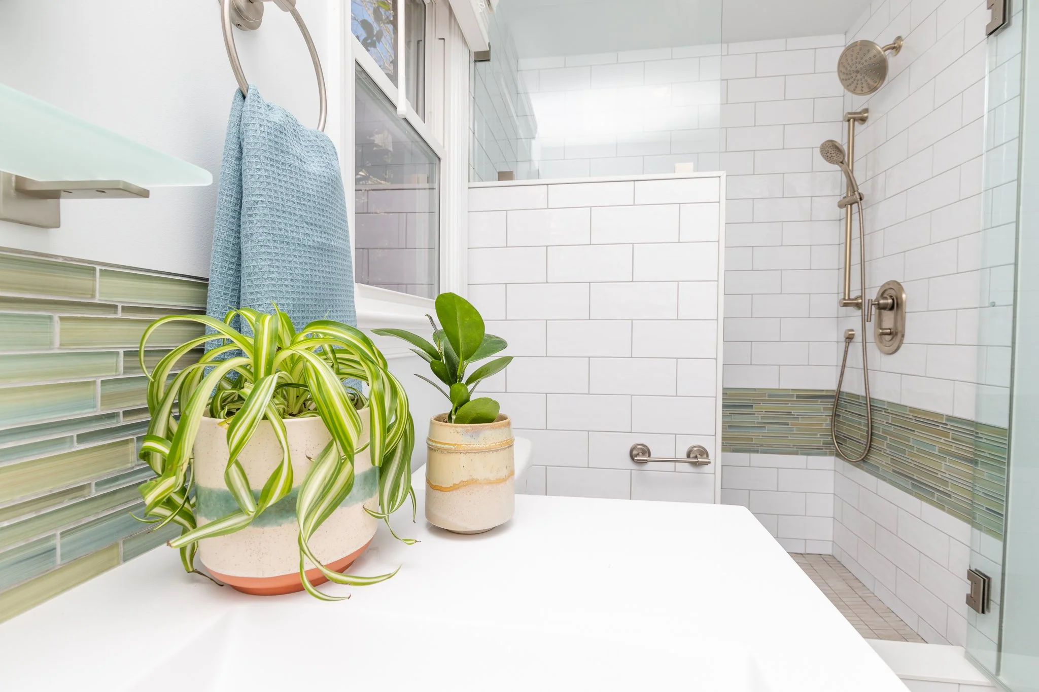
Though the layout remained the same, the new wallpaper, floor tile, vanity, and fixtures make it feel like a completely different space. The dark picket tiles add tons of interest and offer a wonderful contrast to the light color palette of the walls and vanity. And two thumbs up for the mix of metal finishes in the plumbing, accents, and lighting!

AFTER

Yay, design!

Design: Jaime Simpson of Creative + Curated

Contractor: Carlton Building Services

After Photos: Salazar Studios

KITCHEN REMODEL - VIRGINIA BEACH

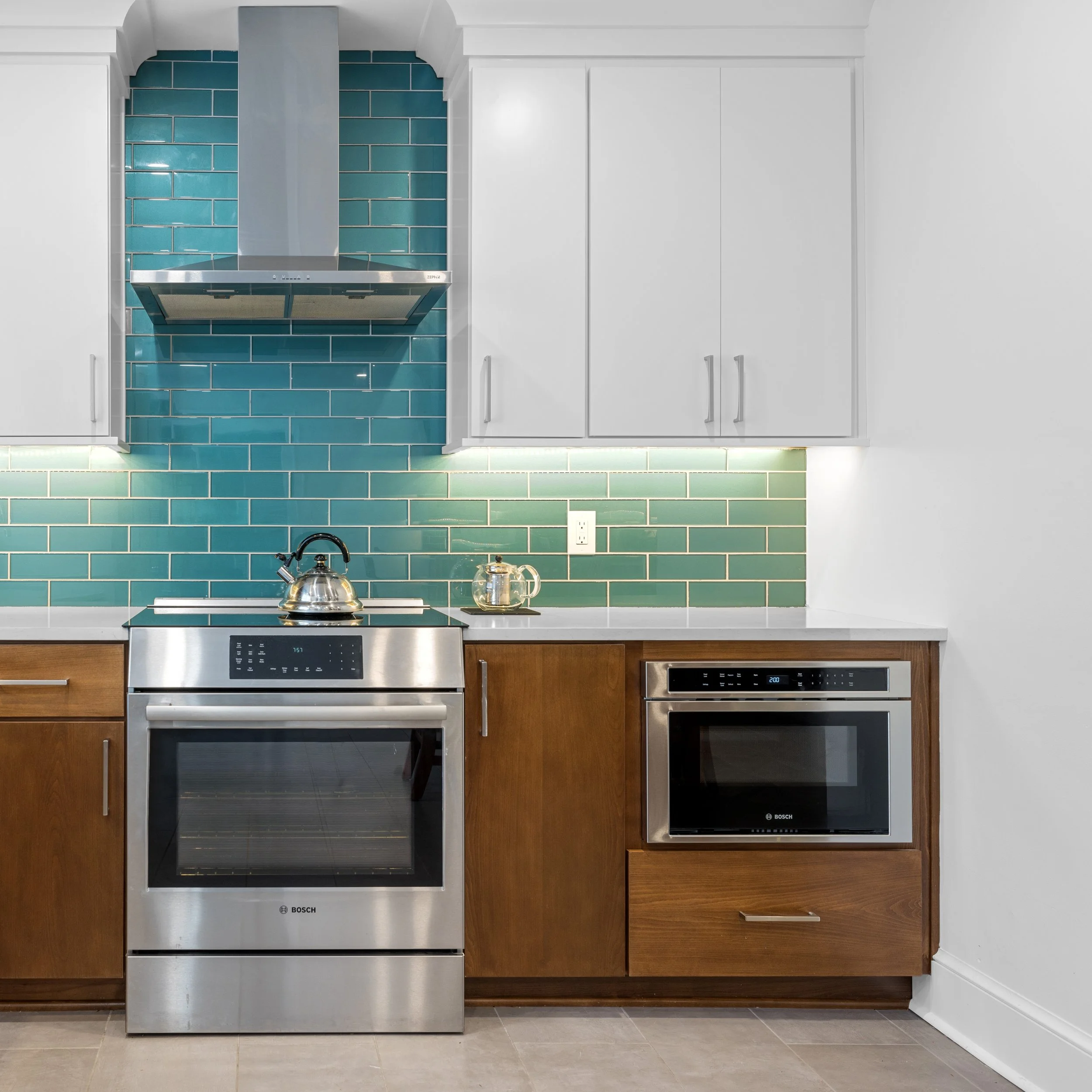
This home is a family treasure; my client’s grandmother originally lived there, and my client now has the joy of keeping it in the family. The kitchen was original to the home and was in need of a refresh. My client wished to infuse new life into the space, adding to the home’s longevity.

AFTER

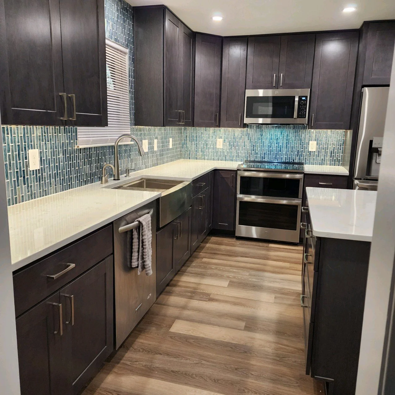
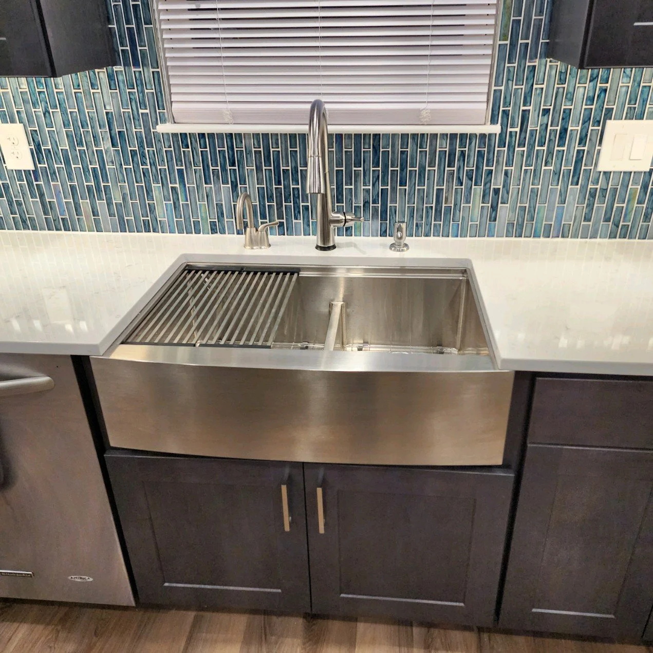
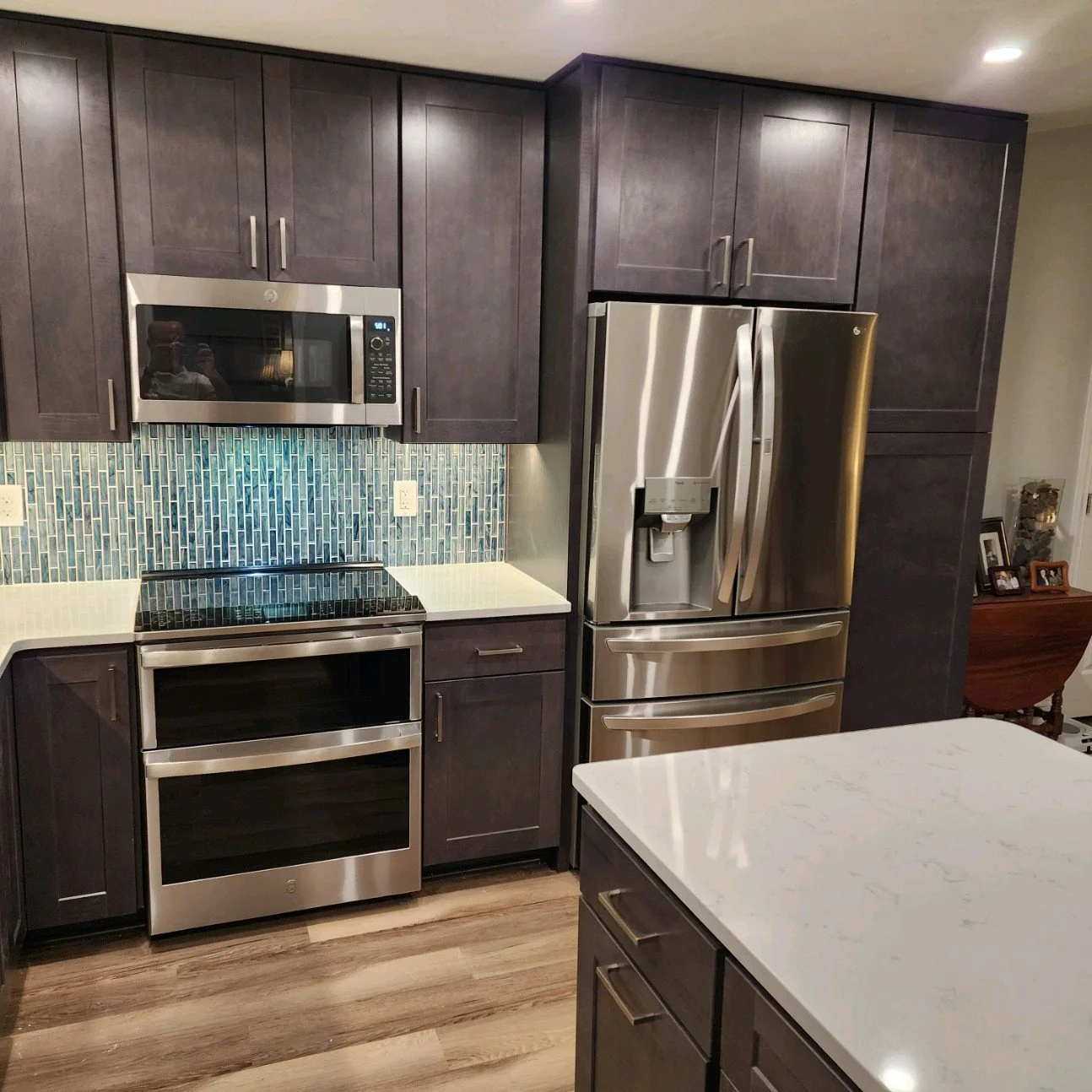
The space originally had a wall between the kitchen and a large front entry. With the wall gone, the space is much more welcoming, and allows for a permanent kitchen island and designated eating area. The client already had the kitchen layout established when I joined the project; I gave it the thumbs up and provided design solutions for the finishes and fixtures. We are thrilled with the rich tone of the cabinetry and how it contrasts with the variation in the flooring. And who doesn’t love a nice pop of blue in a glass tile backsplash?

Design Finishes: Jaime Simpson of Creative + Curated

Contractor: Client’s Own

Photos: Courtesy of Client

KITCHEN REMODEL - YORKTOWN

This family was ready for an update, both aesthetically and functionally. The overall footprint of the kitchen essentially stayed the same, but the space was utilized more efficiently to gain storage and increase countertop space. Cabinetry was added to the wall between kitchen and dining to create a fantastic bar and serving area for this newly revitalized gathering space.

BEFORE

The built-in wall oven was removed to make way for a peninsula, which still left ample space for a large range and chimney style hood. The peninsula not only gave this family significantly more storage and counter space, it also created an eating area that the previous layout was lacking.

design renderings

AFTER

Durable quartz countertops, two-tone cabinetry, stainless steel appliances, and a dimensional backsplash tile come together to make this a fantastic kitchen for the family to enjoy for many years.

Design: Jaime Simpson of Creative + Curated

Contractor: Jim Hicks Home Improvement

Before + After Photos: Courtesy of Jim Hicks Home Improvement

PRIMARY BATH REMODEL - NORFOLK

Though this remodel didn’t involve a full demo or a major layout change, the resulting transformation is still quite dramatic. The clients no longer had a need for the large tub that was using up valuable real estate; they opted to eliminate it to increase the storage capacity of the adjacent primary closet. They were ready for a reset of their color palette and an upgrade in accessories as well.

BEFORE

The shower moved to the tub’s former location, and the area that was the shower was captured for additional hanging and shelf space in the closet. The glass block window was removed, and the new deluxe shower was fitted with a rainshower, two showerheads, a handheld, and a custom bench (that the clients’ contactor was able to float!).

AFTER

Porcelain tile was used for the shower walls and main bathroom floor, and natural stone pebbles were used for the shower floor. The existing cabinetry was given new life with a fresh coat of white paint, new hardware, and a natural stone countertop. The large mirror with integrated LED lighting gives the whole space a bright, modern look. Another project I’m thankful to have been part of.

Design: Jaime Simpson of Creative + Curated

Contractor: Client’s Own

After Photos: Salazar Studios

Home Styling - Norfolk

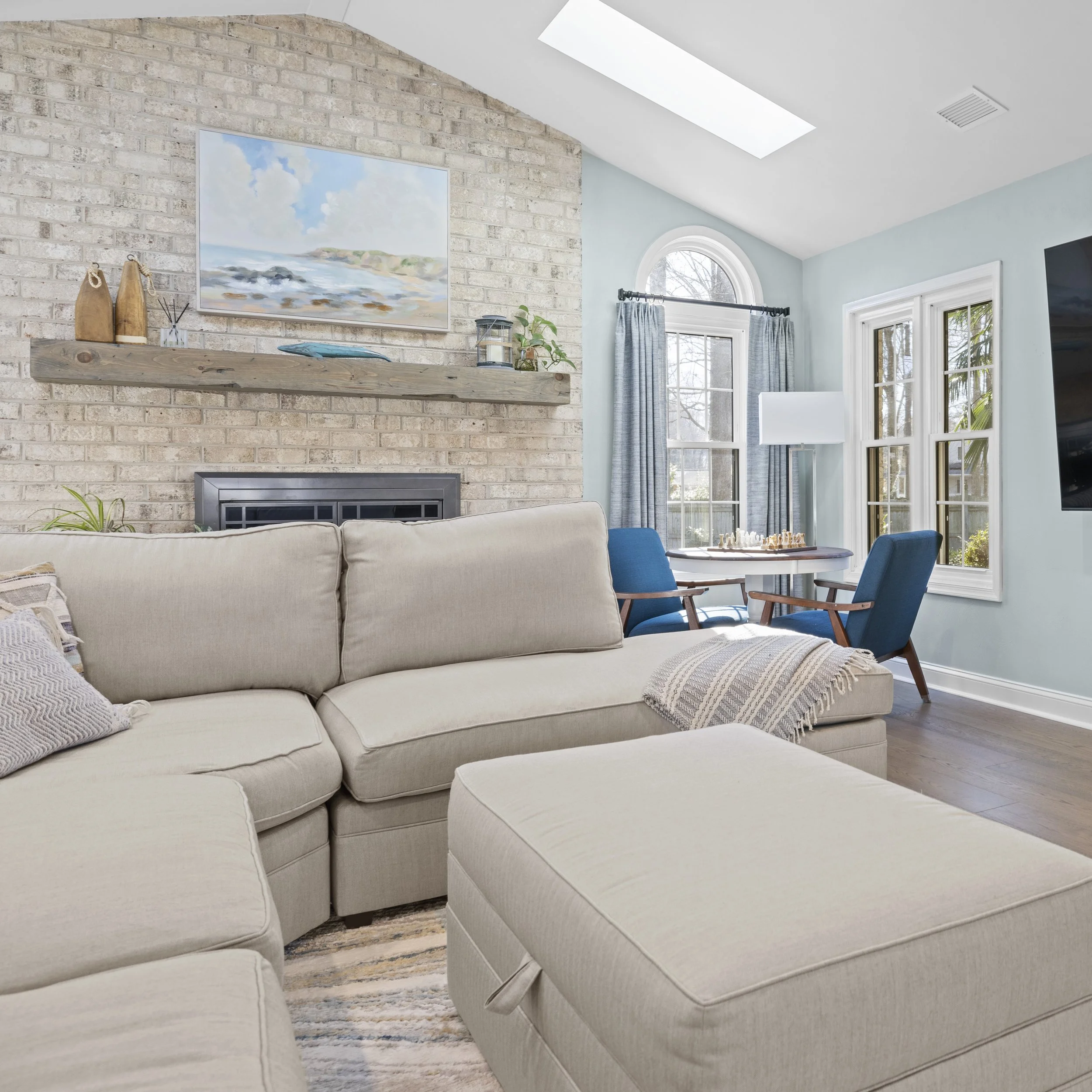
I was thrilled to partner with Ideal Organizing on this fun decor project. These clients had recently purchased a new investment property and were in need of fresh furnishings and accessories. Many of the furniture pieces had already been selected, but I had the joy of adding the finishing touches - the art, window dressings, and accessories.

The goal was a modern coastal vibe, and in my humble opinion, I think we achieved it. I had such a great time selecting and placing these final touches - those are the icing on the cake.

Photos Courtesy of Francesca Chairello

PRIMARY BATH REMODEL - VIRGINIA BEACH

These clients felt lucky to have a spacious primary bath. The problem, however, was that the space was not being utilized in the best ways. The immense tub and tub surround filled up most of the room, leaving the shower space cramped and dark. There was so much untapped potential, and I was beyond ready to help them create the serene and tranquil retreat they had always hoped for.

BEFORE

This was a great collaboration - my design concept gave the clients the tools and information needed for them to source the fixtures and materials, and allow them to play an important part in this transformation in their home. The images below are two of my design renderings for the space.

The existing jetted tub was removed, and the large surround completely demoed to allow for a larger shower. The updated shower was wrapped in a partial wall topped with glass, to allow more light to flow between the shower and main bath area. The reworking of this part of the bathroom, along with a new freestanding tub, made space for additional cabinetry storage.

AFTER

The vanity area kept the same footprint, and was revived with fresh cabinetry, natural stone countertops, a colorful backdrop, and unique sconces. The results are thrilling.

Design: Jaime Simpson of Creative + Curated

Contractor: Coradi Contracting

After Photos: Courtesy of Coradi Contracting

SURFACES - COUNTERTOPS

Granite, marble, and quartz … oh my!

When it comes to selecting countertops, there is certainly much to consider. There are several types of surfaces to choose from, and each has its own set of pros and cons. It is important to focus on how you will use the space and what pros and cons will fit into your lifestyle and daily routine. Not that a countertop choice is a permanent commitment, but countertops are a significant portion of a remodel budget, and the decision should be made thoughtfully.

On that note, let’s discuss those pros and cons shall we? Below I will list the most common surfaces used for countertops (for kitchens, bathrooms, wet bars, etc) and basic tidbits of information about them, and review what’s great and what’s not so great about each.

Photos from past projects. From left to right: quartz, granite, marble, solid surface.


GRANITE

I’m starting with granite because, based on my experience with clients, granite is still one of the most commonly used countertop materials. Granite is a natural stone material that is mined from quarries around the world. It is essentially made up of varying amounts of feldspar, quartz, mica, and minerals. Once it is harvested, it is cut into slabs and shipped to various distributors to then be purchased by fabricators.

Cons:

  • Porous, which means it can absorb liquids and possibly retain bacteria

  • Must be regularly re-sealed to prevent the absorption mentioned above

  • Potential issues with chipping along the edges (if a square edge profile is used)

  • Potential pitting issues with stones with high mica content

  • Higher level price point

Pros:

  • A large variety of unique colors and patterns

  • Multiple finish options (polished, honed, leathered)

  • Tough, scratch resistant surface

  • Heat resistant

  • Stain resistant, though coffee and citrus juices can still cause finish issues

  • Suited for all areas (kitchens, bathrooms, wet bars, outdoor kitchens)


QUARTZ

This name can be misleading … quartz in itself is a natural mineral. But when people say “quartz countertops,” they are not referring to a countertop made of solid mineral. Quartz countertop material is actually manufactured. It does contain small amounts of crushed quartz, along with other raw materials and resins to form slabs similar to granite in thickness and overall size. It is a bit of a mystery exactly what specific materials and proportions of quartz and resins, etc., are used in the different brands that manufacture it, but overall it is a composite and not a fully natural material.

Cons:

  • Patterns appear manufactured - this has improved dramatically but is still getting there

  • UV rays can affect the color - this has also improved in recent years

  • Higher level price point (often higher than some levels of granite)

Pros:

  • A fair amount of variety in color and pattern

  • Multiple finish options, depending on brand (polished, matte, textured)

  • Tough, scratch and chip resistant surface

  • Heat resistant

  • Stain resistant

  • Non-porous, therefore no sealing or re-sealing needed

  • Suited for all areas (though UV rays may affect tops in outdoor kitchens)


MARBLE

Marble is another natural stone that is mined and cut into slabs when it is to be used for countertops. It is a softer material than granite, and is often white or gray and contains veining. This material is created by the metamorphism of sedimentary carbonate rocks which results in a composition of interlocking carbonate crystals (thank you, Wikipedia!). Carrara Marble is likely the most widely recognized with its milky-white background and silvery-grey veining.

Cons:

  • Porous, which means it can absorb liquids and possibly retain bacteria

  • Potential staining issues (red wine and tomato sauce, for example)

  • Citrus, other acidic elements, and vinegar can etch the finish

  • Potential issues with scratching on the surface and chipping on edges - the honed finish helps minimize this issue

  • Higher level price point

  • Can be used in higher traffic work zones (kitchens, wet bars, etc.) but with the understanding that marble in those locations is more susceptible to the issues listed above and needs more TLC

Pros:

  • Classic and timeless - Carrara especially has been used prominently for decades in many applications

  • Multiple finish options (polished or honed)

  • Heat resistant

  • Best suited for bathrooms and lower traffic areas


SOLID SURFACE

By this I mean the manufactured material most commonly known by the brand Corian. (I’m not really here to discuss/promote/review brands in this post, but solid surface countertops tend to be called Corian the way tissues are called Kleenex). Solid surface countertops are composed of acrylics and polyesters, and do not contain natural stone materials. Because of this, solid surface tops can be molded into shape, and have seamless sinks and backsplashes.

Cons:

  • The material itself and the patterns definitely look manufactured

  • Potential issues with scratching

  • Potential issues with staining

  • Potential issues with scorching

  • Mid to high level price point

  • Can be used in higher traffic work zones (kitchens, wet bars, etc.) but with the understanding that solid surface in those locations is more susceptible to the issues listed above

Pros:

  • Fewer seams (as mentioned above)

  • Integrated sink and backsplash options

  • A wide array of color options and a fair amount of pattern options

  • Non-porous, therefore no sealing or re-sealing needed

  • Best suited for bathrooms and lower traffic areas


LAMINATE

Laminate tops also tend to be known by their brands; in this case, the prominent ones are Formica and Wilsonart. The laminate surface is a sheet of plastic fused to a printed paper on a thin backing, to create the actual laminate sheets. Laminate countertops are made two ways: the first is where the tops are custom built and seamed by the fabricator (called self-edge), by taking the laminate sheet and cutting it into the necessary shapes and then gluing them to a particle board or plywood base for sturdiness to then be installed; the second is where the laminate manufacturer forms the laminate sheets onto standard sized bases (of particle board or plywood) that already have the backsplash and edge in place, to create a seamless run of countertop (called Post-Form) that is then cut by the fabricator and installed.

Cons:

  • Though patterns that mimic stone, wood, etc. have improved, it is clearly a laminate

  • Potential issues with scratching

  • Potential issues with scorching

  • With self-edge, issues with liquid getting into the seams are likely, which leads to the base of particle board / plywood swelling up and the laminate peeling

  • Can be used in bathrooms but with the understanding that water tends to splash around a bit more in that area and could lead to higher probability of water getting in the seams

Pros:

  • A plethora of colors and patterns (including granite and wood patterns)

  • Multiple finish options (matte, glossy, textured)

  • With Post-Form, seamless backsplash and edge profiles

  • With self-edge, many shapes and angles can be accommodated

  • Non-porous, therefore no sealing or re-sealing needed

  • Lower price point

  • Best suited for kitchens, desk tops


So, there you have it! My basic assessment of the most commonly used countertop materials available, and what you should consider about each when deciding which direction to go. All have some positive characteristics, and all have some negative characteristics. I have used every one of these successfully in various projects over the years, and there is a place for each of them. It really comes down to which pros mean the most to you and which cons you can live with. I realize that this is just scratching the surface (pun intended) and is also not an exhaustive list of materials; there are others like soapstone, quartzite, slate, etc. that are also used, but as an introductory post, I wanted to focus on the highlights of the main players. Until next time!

JS

KITCHEN REMODEL - YORKTOWN

The clients had two goals for this kitchen remodel: to open and brighten the space, and to update the storage capabilities. With the upper cabinets removed over the peninsula, the brighter finish on the cabinetry, and updated storage features, those goals were accomplished.

BEFORE

AFTER

The textures of the natural stone countertop, porcelain brick-look tiles, and warm wood floors balance the starkness of the custom paint finish of the cabinets. This keeps the area bright yet grounded. The cabinetry is much more functional for the clients’ storage needs and the overall space simply shines.

Design: Jaime Simpson of Creative + Curated

Contractor: Jim Hicks Home Improvement

Photos: Courtesy of Jim Hicks Home Improvement

PRIMARY BATH REMODEL - VIRGINIA BEACH

This project was motivated by a need for repairs - a mystery water leak was causing damage to the shower walls (which could lead to health concerns). Since the bathroom was original to the home, the clients were also ready for a design change. They decided to completely refresh the space while remodeling to address the water leak issue, allowing them to improve the aesthetics and functionality of the space.

BEFORE

AFTER

The layout of the bathroom remained the same; not much else did, however! My design concept removed the tub and added a built-in shower bench. The design also included new porcelain tiles for the bath floor and shower, a glass accent tile with a soft coastal palette, a deep wood tone vanity with drawers for better storage, a glass shelf, brushed nickel fixtures, and soft white walls.

All leak issues were taken care of, and the final result is an eye-catching (and safe) primary bath.

Design: Jaime Simpson of Creative + Curated

Contractor: Phalanx Contracting

After Photos: Lianna Pevar Photography

PRIMARY BATH REMODEL - NORFOLK

This transformation was thrilling. The clients’ original bathroom had a large (and rather dangerous) bathtub / shower combination that they essentially had to climb into every day. It was causing lots of frustration and little enjoyment.

BEFORE

AFTER

The clients decided to eliminate the tub completely; this allowed me to use that entire area for a new spacious shower with a built-in bench, while the vanity and toilet locations remained the same. My design concept included all new fixtures and materials including: a furniture style vanity with a wallpapered accent wall; white ceramic and deep blue glass tiles; pill-shaped mirrors; brushed nickel fixtures; and crisp white walls.

The resulting bathroom gave the clients all they were hoping for - and all those frustrations went right out the (new) window.

Design: Jaime Simpson of Creative + Curated

Contractor: Phalanx Contracting

After Photos: Lianna Pevar Photography

DESIGNING FROM A DISTANCE

Though it is always best to have the opportunity to meet in person during design projects, it is entirely possible to have a productive, positive, and successful experience designing virtually.


When considering how the design process has changed, many things have actually stayed the same: prior to COVID-19, I was often communicating ideas, drawings, and concepts digitally through email; I was familiar with brainstorming with clients who lived out of the area over FaceTime; and I definitely had more than one meeting with suppliers and manufacturers’ reps over Zoom or Skype.

These experiences, unbeknownst to me at the time, prepared me for the shift that has taken place as quarantining and social distancing have become part of the process. I am currently meeting with clients in person (with face coverings, social distancing, and other safety measures in place), but have maintained my virtual services for those clients wishing to have a fully virtual experience, as well as for those clients who are out of my local area.

I’ll give you a bit of a behind the scenes, play by play of how a virtual design experience would go:

Virtual Consultations

(for those interested in consultations only, and not a full design concept)

  • The first step would be a phone call to discuss the general topic of the upcoming consultation and to determine the date and time for the 30 or 60 minute session to be held over FaceTime or Zoom. Any helpful inspiration photos that the clients have collected would be sent to me prior to the consultation.

  • During the consultation, the client would show me the space to be discussed and ask any questions they may have. For example, if a client is looking to update their furniture arrangement, they could show me the space, provide me with any necessary measurements on the spot, and I would then provide my recommendations.

  • After the consultation, I would provide a summary of our discussion, with any decisions and specific selections listed in detail. This would be sent via email.

Design Concepts

  • The first step would again be an initial phone call to discuss the scope of the project, including the general goals of the new design.

  • A virtual consultation would happen next, so that I could see the space(s) in full and have a more in-depth discussion with the clients about the desired changes. Measurements would be provided at this point, and discussion of the desired style and color palette as well. Inspiration photos would be shared with me at this stage.

  • My next step would be to design the layout of the space and create design concepts with my recommended materials, fixtures, and furnishings (usually two different options). This presentation would be sent to the clients via email, and followed up with a phone call to discuss.

  • After receiving feedback from the clients, any necessary revisions would be made and the presentation adjusted. All available physical samples of finishes and fabrics would be sent to the clients for review.

  • Once the layout and selections were finalized, I would put together a spreadsheet of selections with source information for the clients or their contractor. All drawings would have detailed notes to ensure the design is implemented properly.

  • During the execution of the project, I would be available to meet virtually with the clients, the contractors, and tradespeople to confirm details and answer any questions.

  • Once the project is complete, there would be a virtual meeting for me to see the end result and celebrate with my clients.

Despite the changes that have taken place in this industry, much of the design experience remains the same. The virtual process can still be a fun, transformative adventure. There’s just a little more distance involved.

Are you interested in a virtual consultation? Let’s chat!