KITCHEN REMODEL - VIRGINIA BEACH

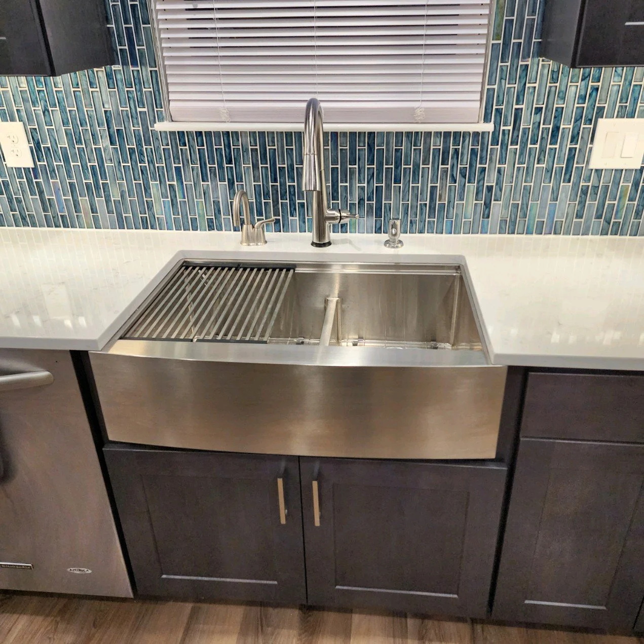
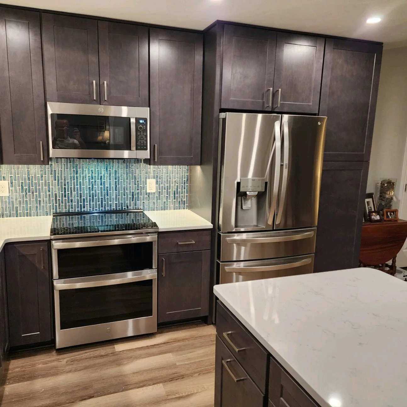
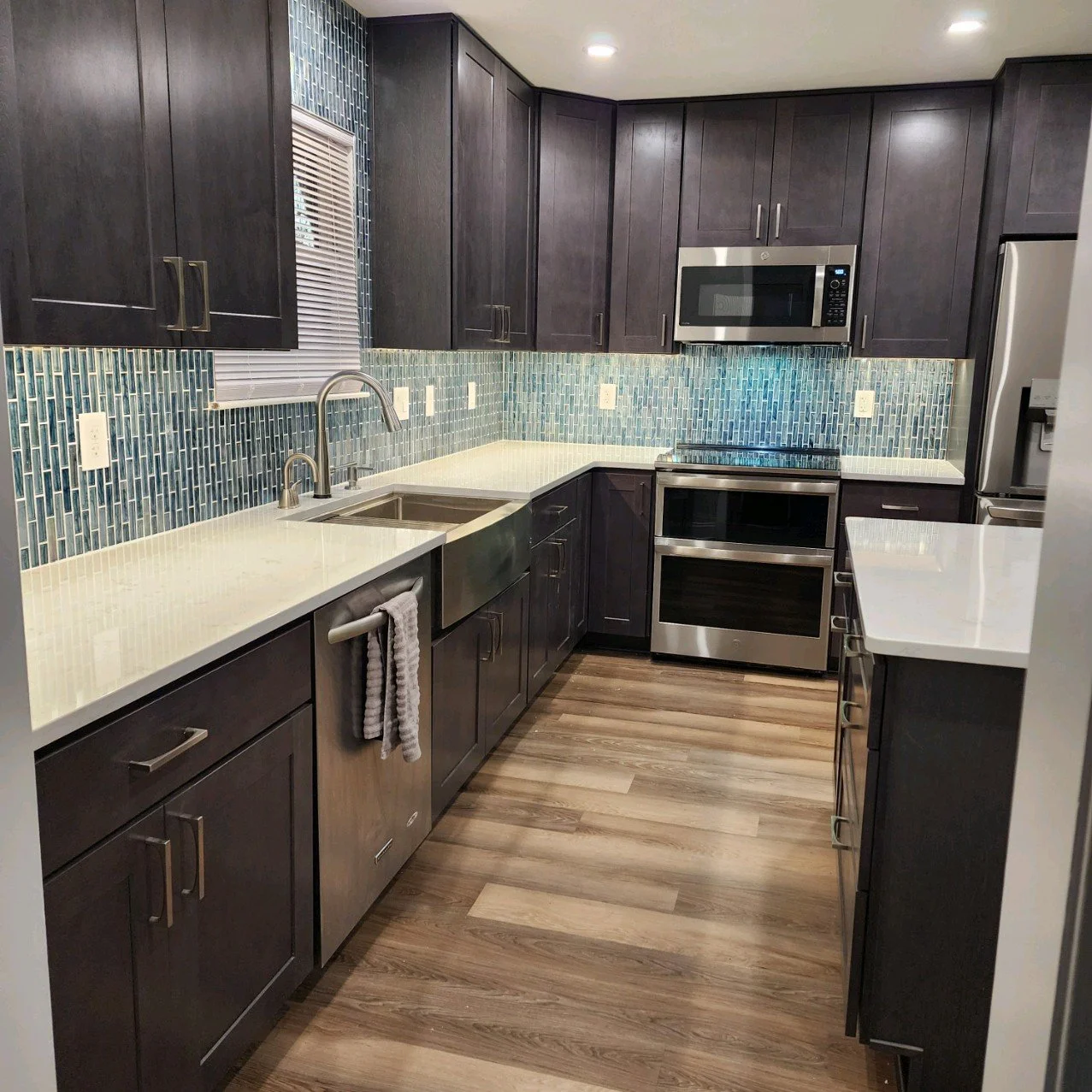
This home is a family treasure; my client’s grandmother originally lived there, and my client now has the joy of keeping it in the family. The kitchen was original to the home and was in need of a refresh. My client wished to infuse new life into the space, adding to the home’s longevity.

AFTER

The space originally had a wall between the kitchen and a large front entry. With the wall gone, the space is much more welcoming, and allows for a permanent kitchen island and designated eating area. The client already had the kitchen layout established when I joined the project; I gave it the thumbs up and provided design solutions for the finishes and fixtures. We are thrilled with the rich tone of the cabinetry and how it contrasts with the variation in the flooring. And who doesn’t love a nice pop of blue in a glass tile backsplash?

Design Finishes: Jaime Simpson of Creative + Curated

Contractor: Client’s Own

Photos: Courtesy of Client
KITCHEN REMODEL - YORKTOWN

This family was ready for an update, both aesthetically and functionally. The overall footprint of the kitchen essentially stayed the same, but the space was utilized more efficiently to gain storage and increase countertop space. Cabinetry was added to the wall between kitchen and dining to create a fantastic bar and serving area for this newly revitalized gathering space.

BEFORE

The built-in wall oven was removed to make way for a peninsula, which still left ample space for a large range and chimney style hood. The peninsula not only gave this family significantly more storage and counter space, it also created an eating area that the previous layout was lacking.

design renderings

AFTER

Durable quartz countertops, two-tone cabinetry, stainless steel appliances, and a dimensional backsplash tile come together to make this a fantastic kitchen for the family to enjoy for many years.

Design: Jaime Simpson of Creative + Curated

Contractor: Jim Hicks Home Improvement

Before + After Photos: Courtesy of Jim Hicks Home Improvement

KITCHEN REMODEL - YORKTOWN

The clients had two goals for this kitchen remodel: to open and brighten the space, and to update the storage capabilities. With the upper cabinets removed over the peninsula, the brighter finish on the cabinetry, and updated storage features, those goals were accomplished.

BEFORE

AFTER

The textures of the natural stone countertop, porcelain brick-look tiles, and warm wood floors balance the starkness of the custom paint finish of the cabinets. This keeps the area bright yet grounded. The cabinetry is much more functional for the clients’ storage needs and the overall space simply shines.

Design: Jaime Simpson of Creative + Curated

Contractor: Jim Hicks Home Improvement

Photos: Courtesy of Jim Hicks Home Improvement