MORE TILE TALK
As a follow up to my recent post in which I discuss the various types of tile, this entry is focused on tile patterns. There are many different ways to arrange tile when installing on walls or floors, and the pattern can have a dramatic effect on the visual results.
The options are extensive, so I will be focusing on the patterns most often used for tile installations.
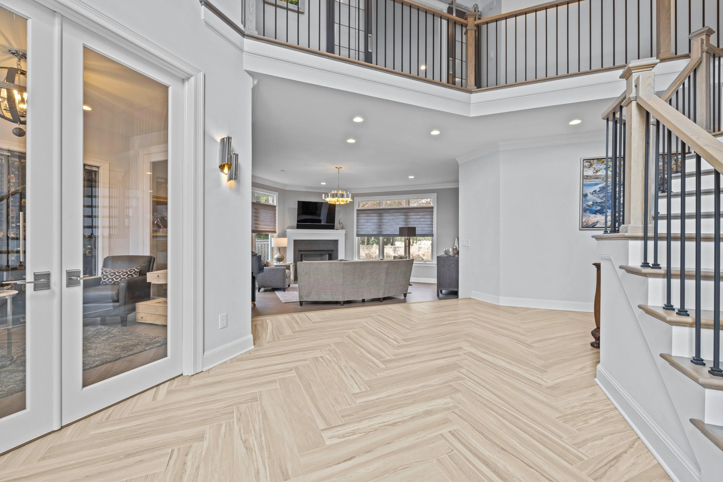
Example photos from past projects. From left to right: brick pattern (horizontal); herringbone; straight stack (horizontal); random stagger.
SET STRAIGHT or Straight stack
Shown horizontally.
This is basically as straightforward as it sounds (no pun intended). This tile pattern is the simplest, where tiles are placed end to end, with all edges lined up (no overlap or stagger). Rectangular tiles can be set straight vertically or horizontally.
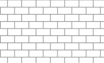
1/2 STAGGER OR BRICK PATTERN
A staggered pattern can be implemented with square or rectangular tiles. The most common of the staggered patterns is the brick pattern or 1/2 stagger. Tiles in a brick pattern are staggered half the overall length of the tile, so that the end of one tile lines up with the center of the tiles above and below it. It is most widely known as a brick pattern because historically bricks are arranged this way.
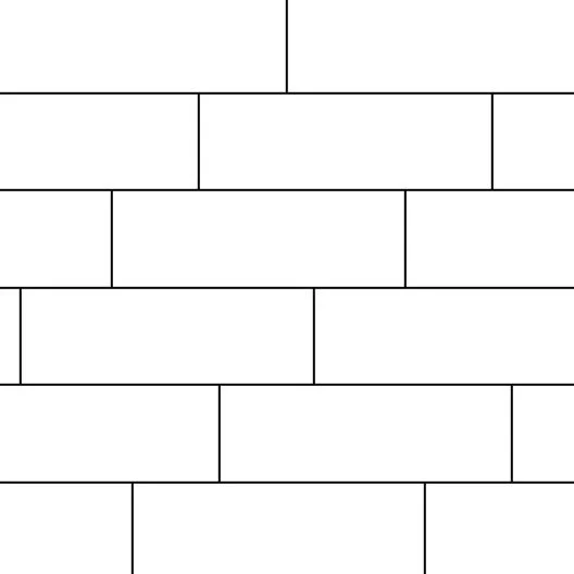
1/3 STAGGER OR 1/3 OFFSET
Directional 1/3 stagger (to right), in horizontal orientation.
Like the brick pattern, the 1/3 stagger or offset is where tiles are staggered across some of the tiles adjacent to it. This can be done with square tiles, but the visual effect is more successful with rectangular tiles. With a 1/3 stagger, the tiles are lined up so that the end of one tile is 1/3 of the length of the tile across the next. This can be done two ways: the first is like steps, where each tile is 1/3 across the next going the same direction; the second is back and forth, where every other tile is 1/3 across, resulting in a back-and-forth placement.
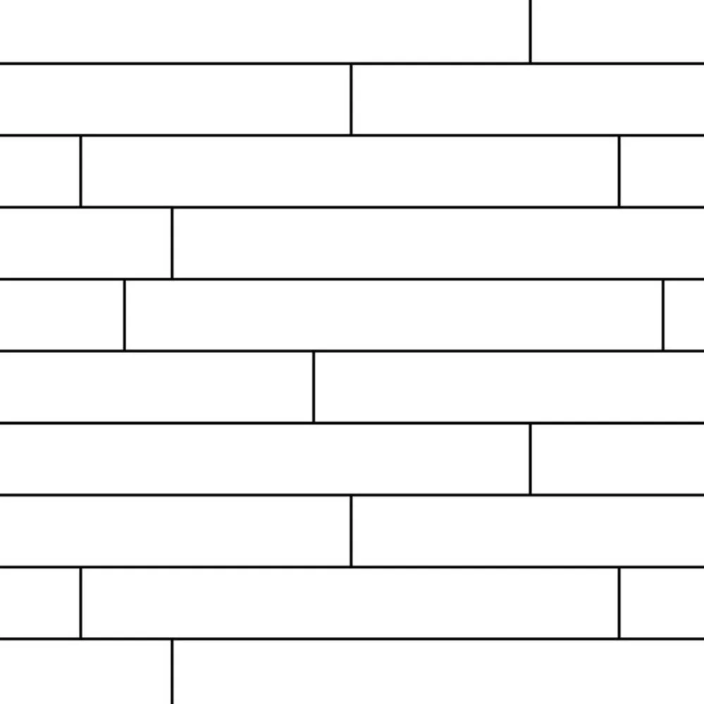
RANDOM STAGGER
As the name implies, a random stagger is a non-specific stagger of each row of tiles. There is no specific distance for each stagger (there are no rules!), so the result is a loose, organic arrangement. This is most often used with plank-style tiles, which are long rectangular tiles (usually 6” x 36” or longer). It is used to emulate the pattern of hardwood flooring, which is typically installed in this way.
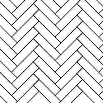
HERRINGBONE
I must admit that the herringbone pattern is a personal favorite. It is classic, timeless, and gives so much interest to a space. It also is wonderful in rooms or hallways with various angles or with walls out of square (straight or directional tile patterns enhance and draw attention to asymmetry and angles, not always in the best way). This pattern is used with rectangular tiles, where the short end of one tile overlaps the long side of the next tile at a 90-degree angle. It is more labor intensive, but so worth it.
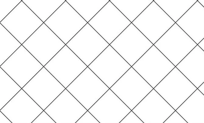
DIAMOND
This pattern is created by taking square tiles that are set straight and rotating the arrangement 45 degrees so that the lines of the tile are now oriented diagonally to the frame of the space. This is a great way to add visual interest without adding lots of labor or tile waste.
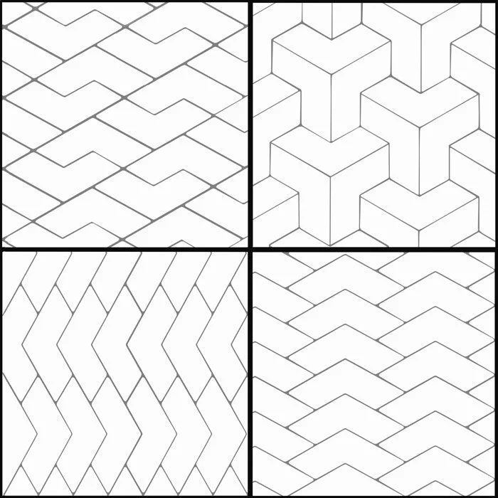
MOSAIC
Example of mosaic patterns with the same tile shape.
Multitudes of mosaic tile patterns are available and are made up of small tiles cut into a specific pattern and placed on a mesh for ease of installation. Mosaic tiles often are in sheets about 12” x 12” and line up with each other so that the seams of the sheets are invisible after installation.
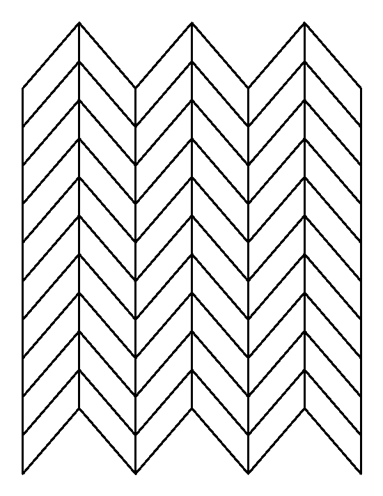
CHEVRON
Shown vertically - chevron can also be run horizontally.
A chevron tile pattern requires a specific tile shape - a parallelogram with two long sides and two shorter sides - and a specific tile placement. The short ends of the tile are placed together to make a “v.” The end result is a modern, sharp take on the herringbone.
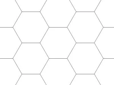
HEXAGON
This pattern is also tile shape specific; the tiles are made in a hexagon shape and nestle together, side to side. Octagonal tiles are also available but are not as common as the hex.
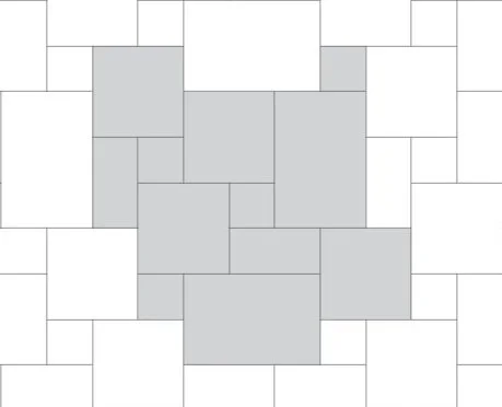
VERSAILLES
Though not as common lately, the Versailles pattern is a classic pattern that incorporates 4 different tile sizes (1 small square, 1 larger square, 1 small rectangle, and 1 larger rectangle). These tiles are arranged in a specific order to create this look. It is a bit like a puzzle, and is more labor intensive. It is commonly used with travertine or other natural stone tiles.
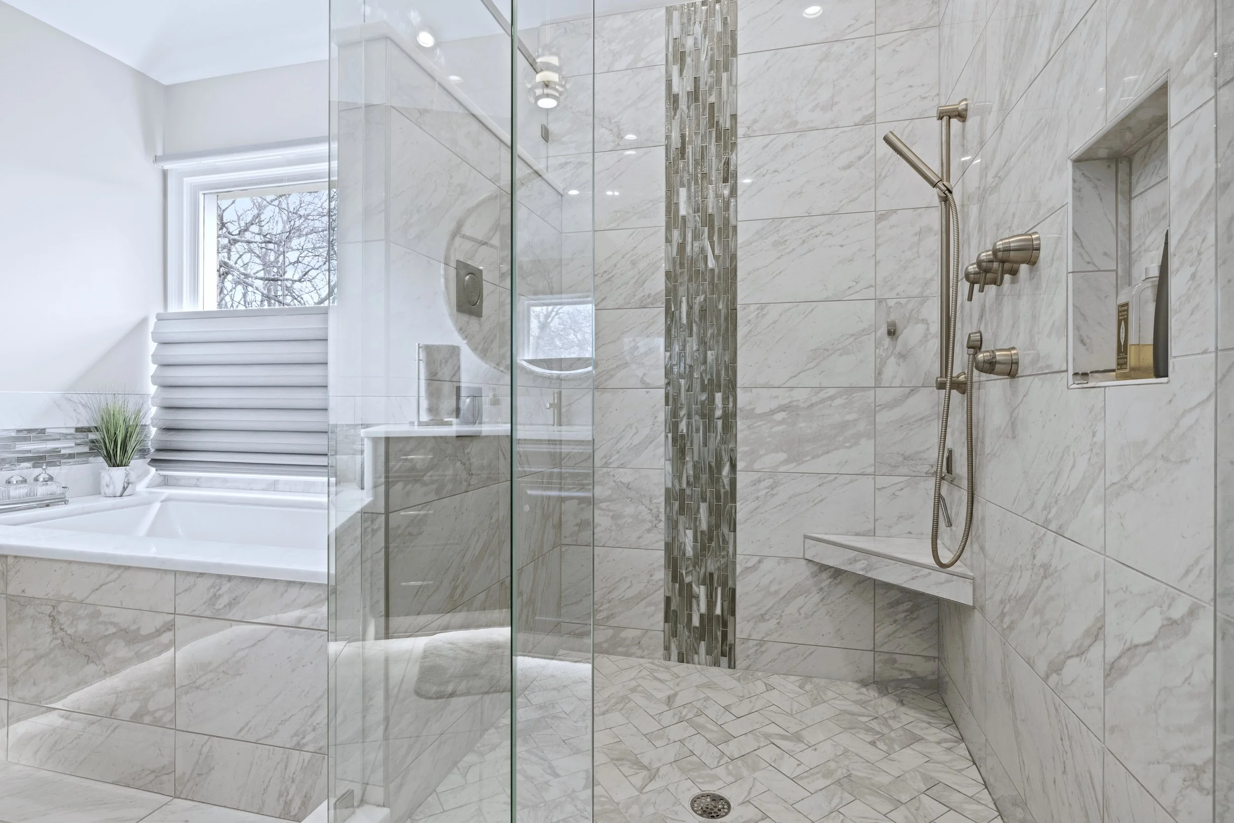
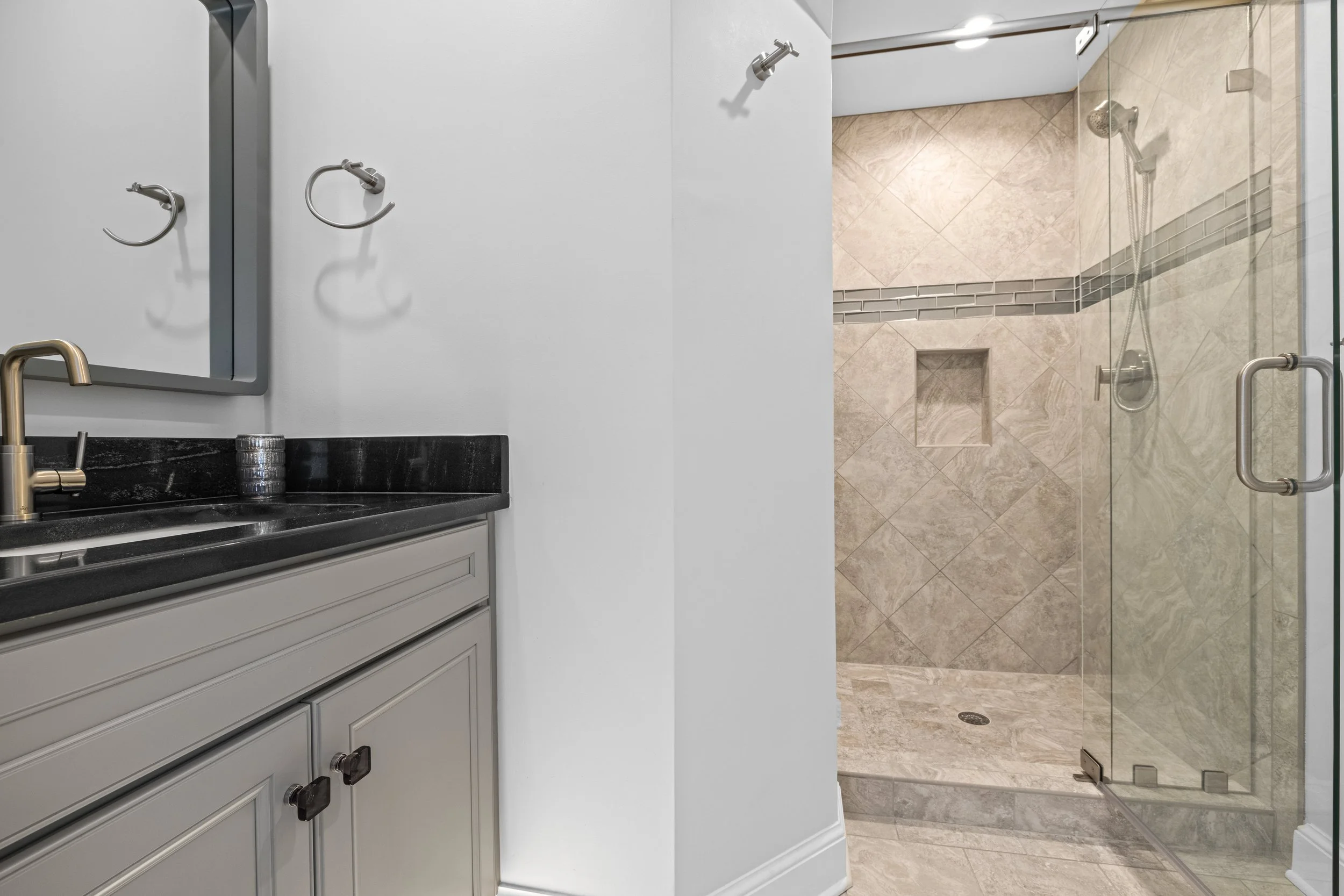
Example photos from past projects. From left to right: herringbone on shower floor, straight stack (horizontal), and waterfall mosaic on wall; mosaic on wall; 1/3 stagger on floor with straight stack (horizontal) in shower; diamond with brick pattern border.
As I mentioned at the top, these are just some of the most common patterns in use these days; there is also the basketweave, the double herringbone, the scallop, the corridor …. So many! It is always great to mix tile patterns also. I usually use two or three patterns in one room (one for the shower floor, one for the shower walls, and one for the main bath floor). I also love to mix patterns on the same surface: perhaps a diamond pattern surrounded by a brick pattern rectangular border; or a vertical waterfall of a random stagger mosaic running through a straight stack of larger tiles; or a chevron inset framed by hexagon tiles. The right color palette and blend of textures can make any of those possible without being too busy. Tile is an amazing material and can make a room a showstopper in so many ways. Yay, tile!
JS
Line drawings found on Google. Project photo credits: Schneider Construction; Lianna Pevar Photography; Salazar Studios.

